Updated Employment Predicted vs. Actual
Innocent Bystanders has updated their chart adding actual unemployment numbers to predictions of Obama's team used to sell the stimulus plan to a gullible American public:
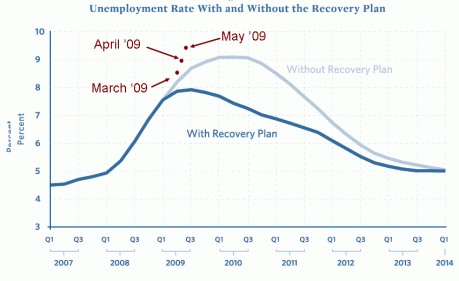
The red dots are the official unemployment figures for the past three months. I guess it would have been worse without the stimulus because of the mild increase in government jobs.
It's clear to me that since most of the stimulus doesn't even take effect until 2010 and 2011, it should just be canceled. Poof, I just suggested saving an incredibly much larger amount of money that the Republicans laughable $23B they offered yesterday.
Josh Poulson
Posted Friday, Jun 5 2009 07:39 AM


