Where Is Your Money Going
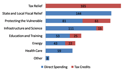
The government has launched recovery.gov to tell us where the stimulus money is going. Today it has this graph on the front page:

Already we are being mislead, although there is a “*” there on the biggest category, tax “relief.” If we click through we find out that tax relief is
* Tax Relief—includes $15 B for Infrastructure and Science, $61 B for Protecting the Vulnerable, $25 B for Education and Training and $22 B for Energy, so total funds are $126 B for Infrastructure and Science, $142 B for Protecting the Vulnerable, $78 B for Education and Training, and $65 B for Energy.
Uh, why did all of those things get rolled up into “tax relief” instead of being allocated those other graph lines that are already on the chart? Because they were all tax credits to various companies (and perhaps individuals in the ambiguous “Protecting the Vulnerable” category). However, as has been noted by Fair Tax advocates, these sorts of tax cuts are really just spending measures disguised by using the tax code to send these entities money.
This misleading graphic doesn't give me a lot of confidence.
(Hat tip to Wizbang!.)
Update:
This is what I think the chart should look like:

Josh Poulson
Posted Wednesday, Feb 18 2009 06:42 AM


